Content
back to Product Families
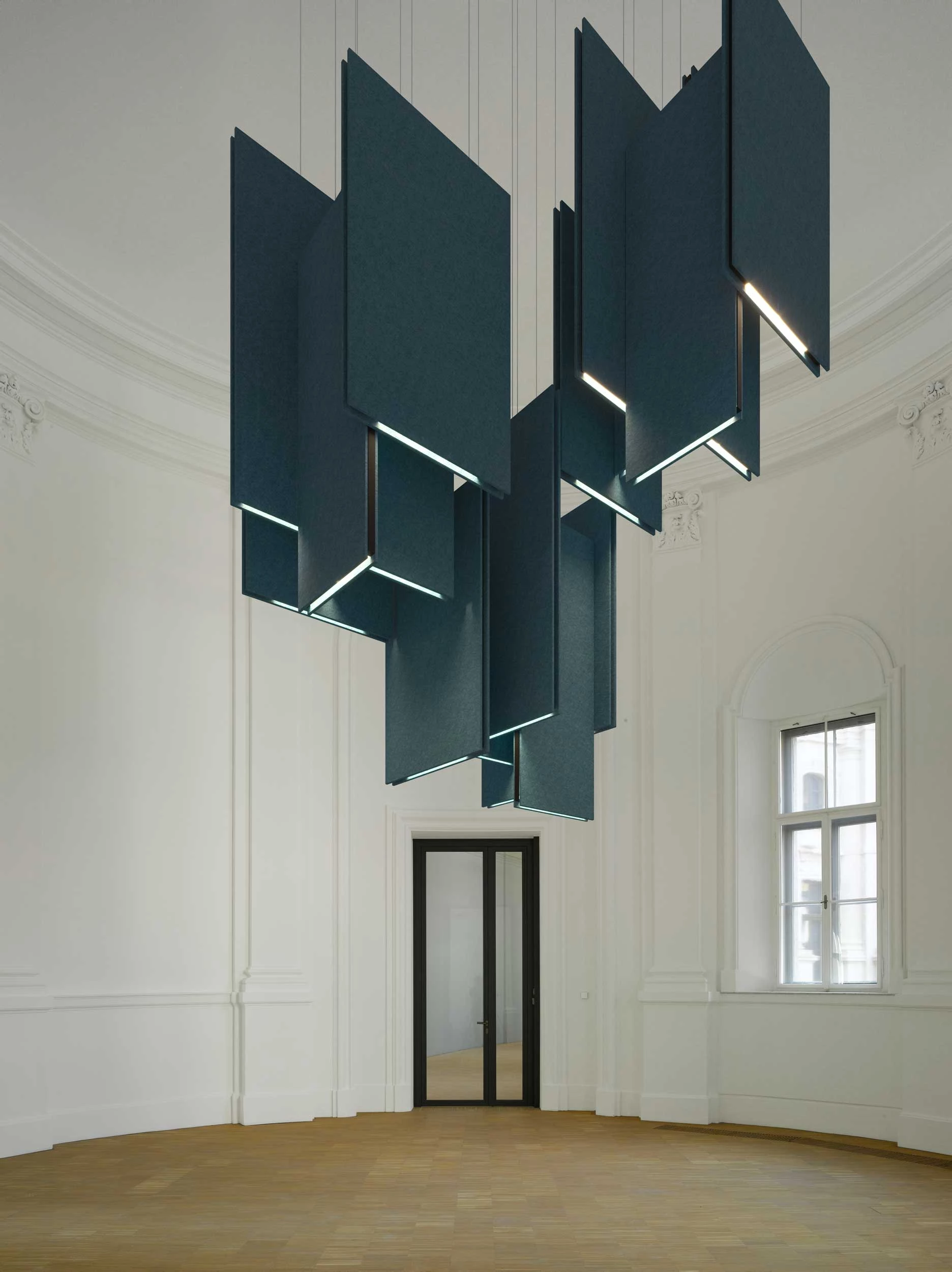
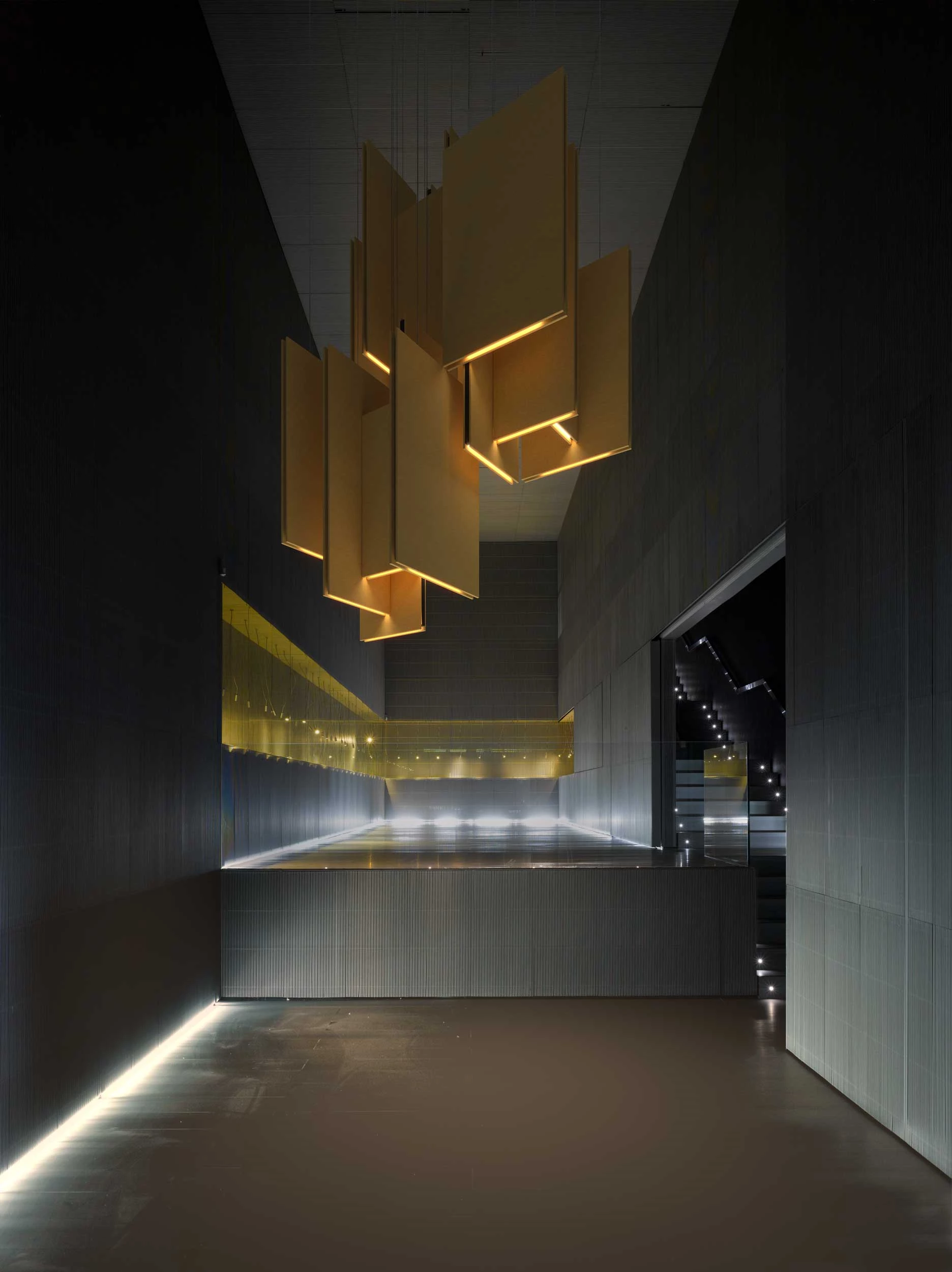
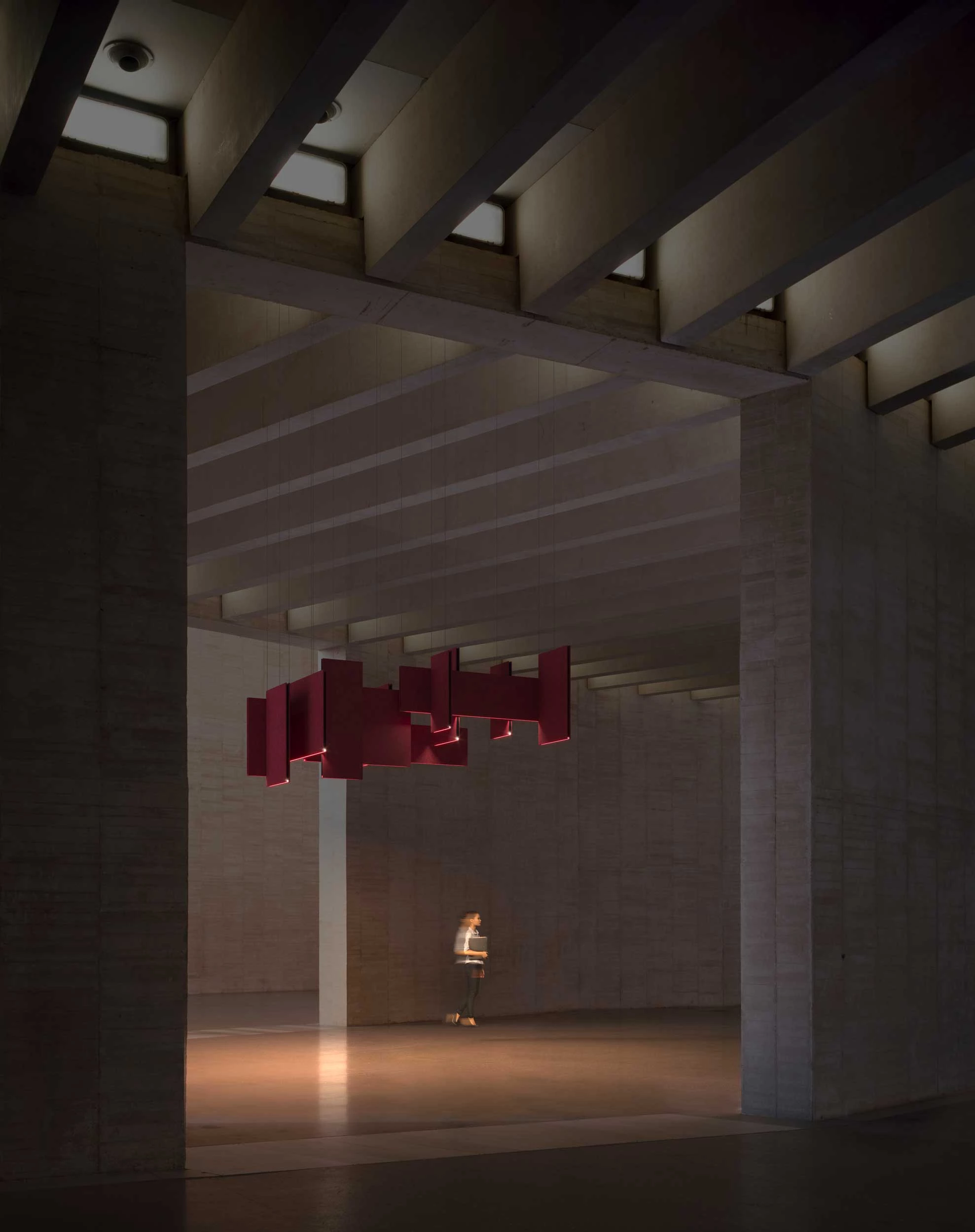
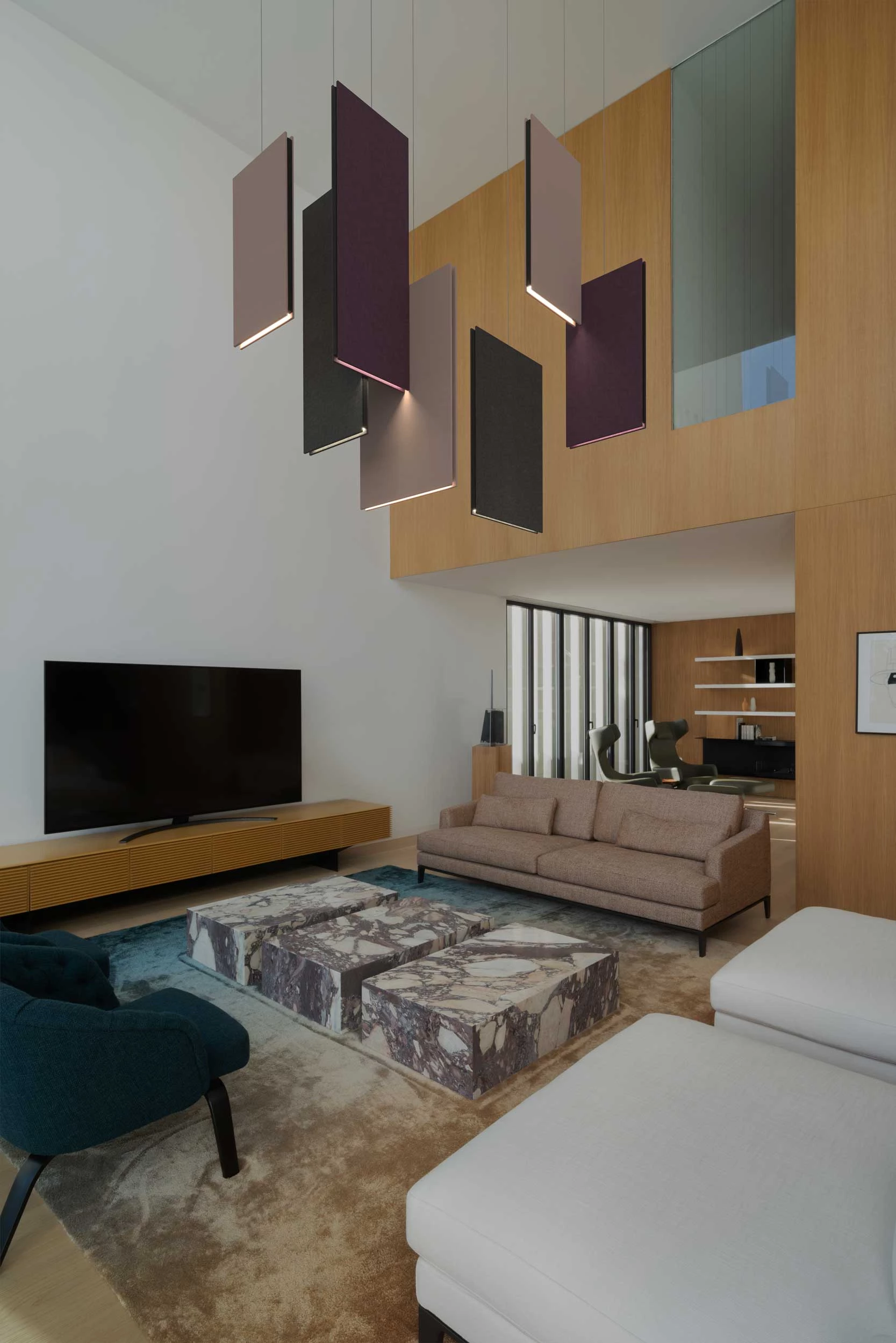
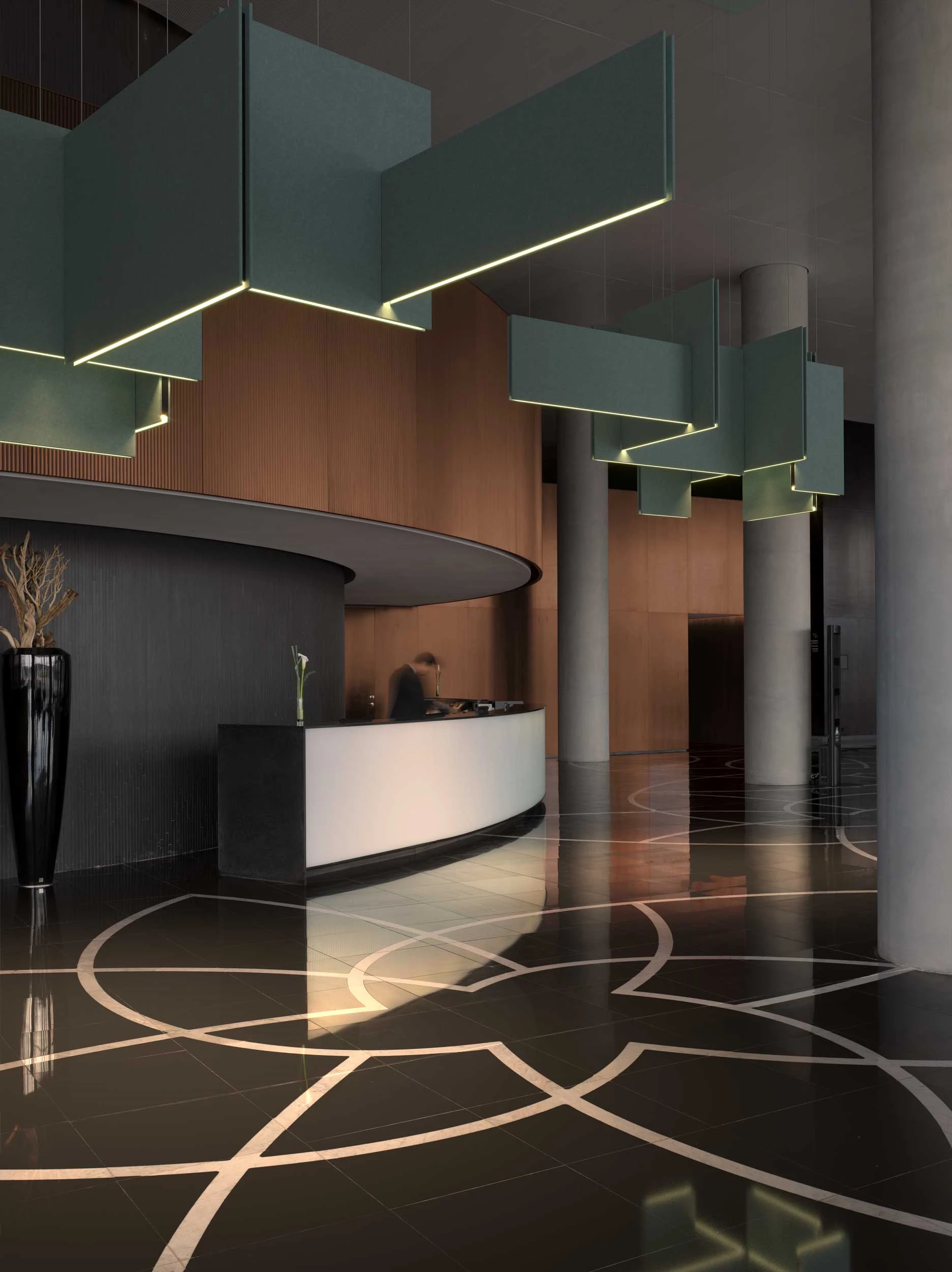
LULLABY
LULLABY is a pendant luminaire designed by Marc Sadler. Thanks to PROLICHT's technologies and materials, LULLABY is a masterpiece that combines sound absorption and lighting.

GET TO KNOW LULLABY
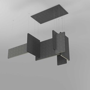
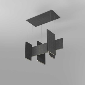
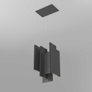
With the unmistakable signature of acclaimed designer Marc Sadler, LULLABY is an unmistakable highlight in any space. You can either choose from six different individual luminaires and create your own light sculpture, or choose from three ready-made combinations.
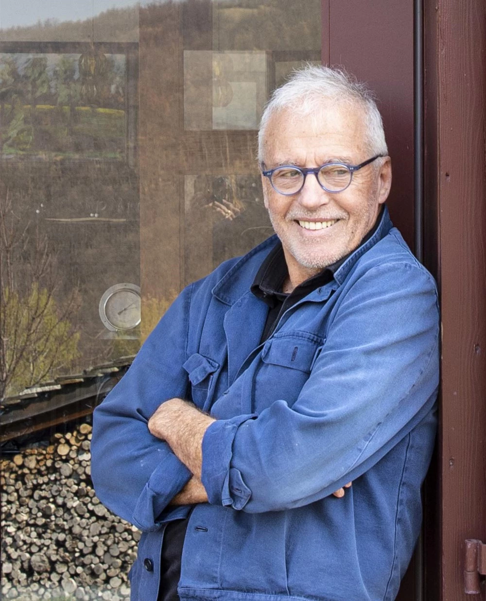
MARC SADLER
Marc Sadler is a designer born in Austria and living in Italy. He was a pioneer in experimenting with various materials and techniques. He is a four-time winner of the international design award Compassi d'Oro ADI and has been repeatedly honoured internationally.
Marc Sadler is recognised as a versatile designer who is able to combine style and functionality.
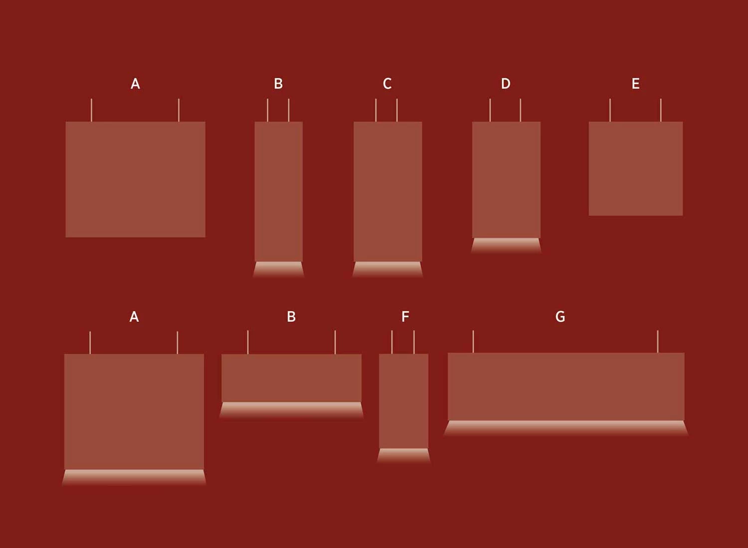
THE LULLABY FAMILY
The family consists of six panels with direct light and off. This allows you to arrange the panels in any way you like. There are three types of panel. A horizontal rectangular panel, a vertical rectangular panel and a square panel. Choose from 32 acoustic colours to add individuality to your creation.
LIGHTING TECHNOLOGY
Lullaby is fitted with ingenious microfibre reflectors to direct the light and prevent glare from the acoustic material. The LEDs can be fitted in four different light colours: 2700K, 3000K, 3500K, 4000K. The CRI is greater than 90 for all light colours, ensuring perfect light for any application.
COLORS MAKE A DIFFERENCE
Individualization is a top priority at PROLICHT - each luminaire can be refined with our 32 Acoustic colors. Find the perfect color combination to create the perfect atmosphere for a holistic interior design concept or to set specific accents.
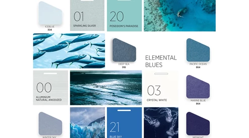
ELEMENTAL BLUES
We had to pay tribute to our blue planet with a collection of sea- and sky-inspired hues. As our air and water quality are increasingly under threat, the appeal of nature’s blues becomes stronger. With the power to calm or energise, the lure of the open water and endless skies is precious and eternal. These blues work perfectly both as familiar single hues and in effortless tonal layers to create an immersive environment for focus or restoration.
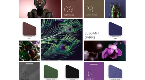
ELEGANT DARKS
While color can create a mood, it is the depth or lightness of a hue that truly defines the emotion. Luxury will forever be synonymous with the most pigmented hues, and with an almost velvety aesthetic, these are contemporary shades that enhance polished woods and metals and after-dark venues. While each hue has the strength to stand alone, beautiful effects can be achieved with harmonised pairs.
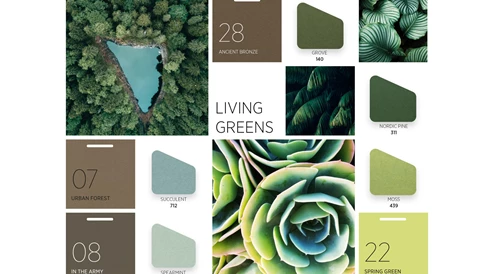
LIVING GREENS
Our green color preferences are informed by our geography, and with these four hues we aim to capture the essence of greens around the globe. From the cool greens of Nordic pine forests to the yellowed aspect of young wheat, we see Living Greens breathing life into indoor spaces, and an essential palette for the future. Use in tonal layers brings the depth and diversity of green, while a single note can provide an amplifying backdrop to a biophilic space.
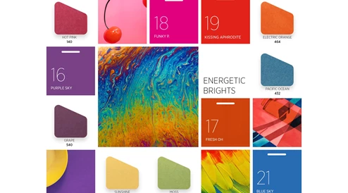
ENERGETIC BRIGHTS
With each color family represented from yellow through to both color accents and the zoning and wayfinding of larger areas. There are no rules here with endless possibilities for clashing contrasts or surprising highlights. For a sophisticated use of energetic color, take a single hue and color match contrasting textiles and solid surfaces.
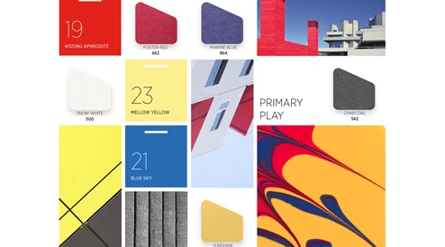
PRIMARY PLAY
Their beauty lies in their simplicity, and in combination with their childhood familiarity, the addition of almost black and white brings a cool graphic touch. While corporate branding and commeRcial space zoning are natural outcomes for individual primary brights, we see directional applications increasing in importance. The primary story happens when all three main colors are used together, with varied proportions creating differing moods. As with the Energetic Brights palette, combine with coordinating colored textiles and solid surfaces.
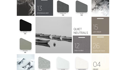
QUIET NEUTRALS
In the ephemeral wisp of smoke from a log fire, the slowly shifting clouds above a mountain or a raindrop on a window there’s a sense of gentle motion that soothes the senses. We enhanced these elemental concepts with colors inspired by gentle wildlife. These shades work in harmony with natural textural materials and soften industrial environments. From light to dark and cool to warm, these are the foundations of any scheme where longevity and a mood of calm is desired.
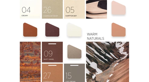
WARM NATURALS
The greatest comfort is often to be found in nature, both in its awe-inspiring grandiosity and its simple beauty. From the rich red of rugged canyons to the soft pink of delicate shells we gathered the perfect hues to create a color mood to comfort, cocoon and protect. Combinations of lighter toned neutrals and pinks have a gently soothing and restorative effect while the more saturated hues make perfect environments for relaxation.
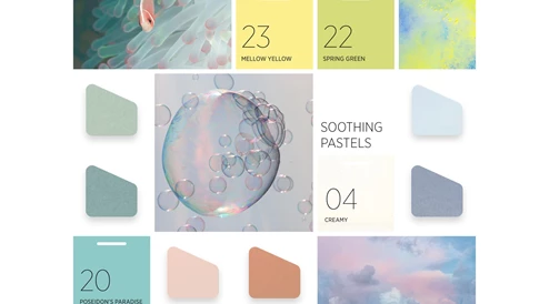
SOOTHING PASTELS
This directional color collection is curated from our core palettes of Elemental Blues, Living Greens and Warm Naturals. Combined with shades from the Quiet Neutrals collection and natural materials, these colors take on a timeless quality. With tonal duos of pink and blue and green, this perfectly balanced group is designed for peaceful plays on light and shade and playful contrast. While the lightest tones have a dreamlike quality, their deeper counterparts add a subtle grounding.